
Paris, Brussels, and Brugge Travel Promotion
A former professor of mine leads annual art and culture tours all over the world, and each year, I design the promotional materials. These are generally one-color, two-sided, 8.5″×11″ folded mailers. Each year presents the challenge of developing an aesthetic evocative of the country or region of that year’s tour.
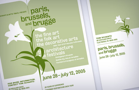
My first thoughts for “Paris, Brussels, and Brugge” were of Art Nouveau-era French poster design (Toulouse-Lautrec and Grasset, for example), but the one-color barrier proved too severe an impediment to what I find to be one of the strongest elements of that work (the vivid colors). I opted instead for a more restrained—almost Swiss—layout and illustration, using an American typeface (Bureau) whose subtly whimsical curves nevertheless seem to speak French.
Responsibilities: Design, Illustration