An Illustrated Retrospective
06 June 2005
Monday, 12:10 AM
Late in 2001, when CDNOW finally succumbed to the dot com crash and unemployment was imminent, I realized that a personal web site would be a necessity if I was to find another job. Self-promotion can be a tricky thing for any designer, especially a borderline-OCD perfectionist like myself. Personal deadlines tend to be meaningless if I feel my work is not up to snuff, and I am, without question, my own worst critic and client.
In those days, my design process was less than optimal, foregoing preliminary structural planning and sketches in favor of just diving right into layout on the computer. As a result, I had a habit of painting myself into corners, and abandoned comps began piling up fast and thick, poignantly emphasizing the irony that my lazy process actually caused me a lot more work.
What follow are some examples of what this site used to be, as well as what it might have been. I don’t do this without humility, even though some of the stuff I could have shown is considerably more cringe-worthy.
Version 1, Comp 4 (December 2001)
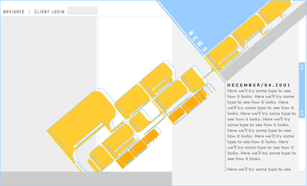
The first version of this site was built entirely in Flash, ignoring the concomitant usability issues in favor of, like, totally bitchin’ animated transitions! Actually, I wanted to do more Flash work, and initially, the site’s sole audience was design studios with employment opportunities, so this really wasn’t a terrible idea at the time. But this particular layout quickly became problematic, chiefly because of the illegible title (that gold and orange blob says “Rob Weychert Dot Com”), set in a display face of my own design, inspired by (the apparently inimitable) Chris Ware. The title became even more illegible when relegated to a low-contrast background image with content sitting on top of it.
The portfolio section for this version was completely programmed in Flash before I abandoned the layout.
Version 1, Comp 7 (January 2002)
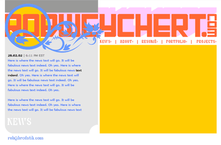
More Chris Ware worship, this time focusing on his exquisite combination of Art Nouveau and Russian Constructivist styles. This one was thrown on the pile because I was dissatisfied with my attempts at homegrown ornamentation. I still really like this color scheme.
Version 1, Comp 9 (March 2002: Final Version)
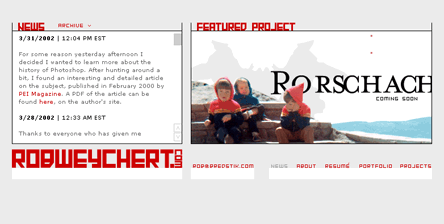
The version that finally made it online salvaged the grid structure and Constructivist typeface I developed for Comp 7, but stripped away the bright colors and ornamentation, favoring a stark, minimalist layout. All textual content (News, About, Resumé) appeared in the box on the left, and portfolio items and other creative projects appeared on the right.
Version 2, Comp 1 (July 2002: Final Version)
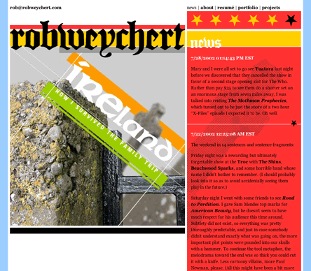
As my Blogger-powered, K10K-style news box quickly turned into an actual blog, I realized that an HTML-based solution for the site would make a lot more sense. Version 2 was designed and developed in about three weeks, and replaced its three-month-old predecessor in July 2002. I’m not sure how this one happened so quickly, considering the agonizing process behind most of its siblings, but I liked its bold colors and propagandistic attitude.
However, as unemployment gave way to lethargy, personal projects were few and far between, and creating a unique, massive image to promote each one on the left side of the home page demanded more effort than I was willing to put forth. In addition, the text column on the right would stretch pretty far down on archive pages, making for an unbalanced layout and a reading experience that required a lot of scrolling.
Version 3, Comp 1 (October 2002)
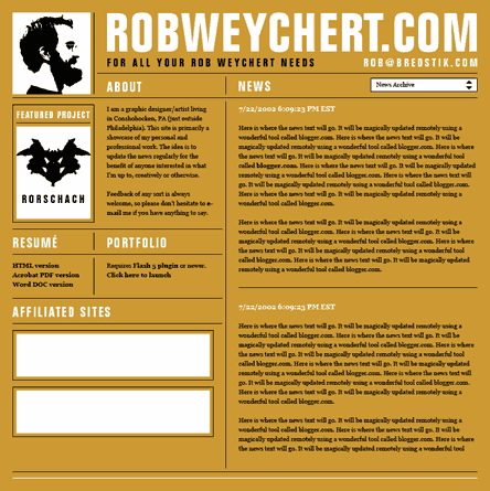
By far my favorite of the discarded comps, I think I actually like this design better than any of the live versions that preceded Version 4. Its grid is solid and hints at the newspaper look that would come later. Its limited color scheme reflects one of my greatest passions in the print world: opaque white and black ink on brown paper or cardboard. And the mug shot in the top left corner of the page was an animated GIF that would turn to glare at you every two minutes or so.
I don’t quite remember why this one got tossed. I think it was created at a time when I was most fickle about my own work, and I got tired of looking at it. Revisiting it now, though, I wouldn’t be surprised if it was eventually refined and reborn in some other form…
Version 3, Comp 6 (July 2003: Final Version)
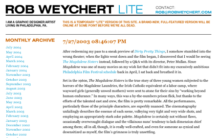
This infamous “Lite” version, a restrained Swiss layout, was thrown together in a matter of hours as a stopgap measure to make Version 2 a part of the past. Not intended to be online for more than a couple of months, it reduced the site to a blog, with a handful of links to recent projects and affiliated sites. The subhead copy resonated with foolish optimism, its announcement of the new design’s arrival date changing numerous times before finally settling on “sometime before we’re all dead.” Naturally, this, the only version of the site that was designed to be truly temporary, was the one that lasted the longest. It survived a total of twenty-six months before finally being replaced in late March 2005 by the fully-featured, standards-compliant Version 4, current as of this post’s date.
Filed under: Art/Design, Site
Comments Closed (13)
2. Jens Meiert says… | 06 June 2005 / 5:02 AM
Agree to Jordan. It's always nice to see how oneself and others progress - that's life, isn't it.
By the way, I hope to see more personal sites applying user-tests. Currently preparing my own site's comprehensive redesign, I think about some "guerilla" methods of user-testing... prototyping with colleagues, testing with neighbors, and so on... Stay tuned.
3. Jeff Louella says… | 06 June 2005 / 7:55 AM
My site www.mookee.com is on its 7 redesign and I hate this one. But I am pretty much giving it all up.
4. Jason Santa Maria says… | 06 June 2005 / 9:44 AM
I loved Version 1, Comp 7 (January 2002), and I loved it even more when we convinced you to rework it for this site. It didn't make the cut, even in it's most recent state (not pictured, but cooler still than it's earlier form above). Not that I mind this chosen design, it's hott, but I also really hope that comp 7 gets to see the light of day again.
What Rob didn't really mention were about 30 other comps and permutations of the designs above, all of which would have been completely worthy of being chosen. There was a comic strip of Rob that Kevin drew which was online here just before this most recent launch. You should comment and link to it Rob since it sums up this post so nicely.
5. Rob Weychert says… | 06 June 2005 / 10:11 AM
Jordan, I’m bound to eventually grow tired of the current design, and its shortcomings will become more apparent to me, but I don’t expect to ever say nasty things about it. It is unquestionably a milestone in my site’s history, quite a bit more than any of the designs that came before.
Jens, I usually involve my friends and colleagues in the process, particularly Stan and Kevin. I’m definitely not an island when it comes to design. Multiple perspectives are essential.
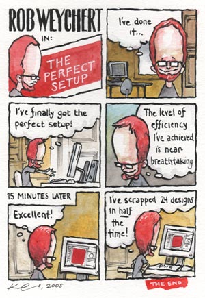
Stan, your wish is my command. This cartoon by Kevin Cornell sums up my neuroses quite well:
6. Jordan Moore says… | 06 June 2005 / 11:51 AM
Rob, when I said, "you will think it's 'bad'", it was a poor choice of words. I meant that it won't be as good (in comparison) as your design five years from now. This design is far from "bad". If anything, it's bad-@$$.
7. bearskinrug says… | 07 June 2005 / 7:10 AM
I was a really big fan of version 3, comp I, Rob. I remember the animated .gif being one of my favorite additions. When you turned your head, you had a CREEPY look on your face that was priceless.
Version 1, Comp 7 was great too. Do you think you could produce better ornamentation now?
It's a shame there's not room here for all the permutations. There were some other ones I really liked...
8. Rob Weychert says… | 07 June 2005 / 11:01 AM
bearskinrug, I guess it’s been awhile since I really tried to design my own ornamentation. Since that comp’s attempt, I have read Owen Jones’s The Grammer of Ornament, which has given me quite a bit more insight into the general history and influence of regional culture on ornamental design. So my next attempt will definitely have a different and more informed methodology, and hopefully it will be more successful.
9. Greg Hoy says… | 07 June 2005 / 10:37 PM
The tagline "For All Your Rob Weychert Needs" in V3.1 is priceless.
10. Scott Zanskas says… | 08 June 2005 / 3:11 PM
Seeing the different layouts you have created over time was great. I find myself spending more time on designing and tweaking little things than on writing actual content. Your current design reminds me of how an article in a magazine might look. Good job.
11. Sebastian Schmieg says… | 08 June 2005 / 6:42 PM
That's interesting. And brave. I'd never show the first comp (1 of 2) of my current site...
V3 C1 looks in deed very good. I'd love to see it online, especially the animated gif!
Selfmade ornamentaion? Wow, I wonder when I'll have the time to try that out myself.
12. Richard Rutter says… | 17 June 2005 / 9:19 AM
How does the saying go, Rob? There's nothing so permanent as a temporary solution. The number of times that one's bitten me in the past...
And for the record, Version 3, Comp 1 - the brown one - kicks bottoms. Every website should be brown.
13. Rob Weychert says… | 17 June 2005 / 9:54 AM
Richard, I actually hadn’t heard that saying before, but it certainly rings true, and it’s been a valuable lesson learned (albeit… very… slowly…).

1. Jordan Moore says… | 06 June 2005 / 3:39 AM
I've always found it interesting to see the past designs of any web site. It shows the path of maturity that some designers have taken, and gives hope to beginners by showing them that nobody starts out perfect.
Extra thought: Just think, in less than five years you will probably write a similar post that has a screenshot of the current design, and you will think it's "bad".