Titonic
13 June 2006
Tuesday, 11:59 PM
It was the beginning of a new millennium. School was in my past, a magazine production job in Manhattan was in my future, and limbo consisted of waiting tables in New Brunswick, New Jersey. It may as well have been Mars. I knew no one, and my ghetto neighborhood, animosity for hostile Jersey traffic, and underdeveloped sense of direction prevented me from venturing out much (to say nothing of the dearth of places worth visiting). In social and cultural isolation, I turned to the World Wide Web for aesthetic guidance and discovered Epitonic, a champion of independent music whose calculated mix of information, editorial content, and free, legal MP3 downloads would help shape my listening habits for years to come. Hundreds of musicians from the worlds of rock, folk, pop, electronic, hip hop, jazz, experimental, and modern classical music were there, catalogued, cross-referenced, and waiting to be heard. The site’s design was not especially inventive or breathtaking, but it was attractive, functional, and easy to use. All in all, Epitonic was nothing less than a godsend.
As so many great sites do, Epitonic fizzled out almost two years ago. It remained online, but updates ceased completely and without explanation. And so I was delighted to find a brand new Epitonic newsletter in my inbox yesterday, heralding its rebirth and redesign. I raced to the hyperlink at the bottom of the e-mail, giddily anticipating a tearful reunion with an old friend. Imagine my horror when I found my friend covered in sores, barely able to stand.

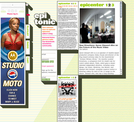
The new Epitonic site is a colossal, abject failure of design. It is so thoroughly obnoxious, in fact, that I don’t even know where to begin describing its monstrosity. Perhaps I should start with the visuals, wherein the competently fun color scheme and inviting headline type belie a total lack of hierarchy, balance, and a hopelessly incoherent layout. Or maybe it would be best to first describe its build: a swamp of frames, scrollbars, and a perversely misguided attempt at a liquid layout. How about the functionality? The music player that requires registration and the password retrieval and login forms that don’t work? There are countless other little details that must be experienced to be believed. Maybe you should just go see for yourself.
There are a great many poorly designed web sites out there, and lots of them have high visibility. So why am I picking on Epitonic? Part of it has to do with seeing such a great site get such an incredibly shitty “makeover,” but the main thing that blows my mind about this particular belly flop is its ingenuity. Most bad web design repeats history, replicating the same pitfalls we’ve seen so many times before. Table layouts, frames, font tags, Flash abuse, etc. Everyone has made these sorts of mistakes at one time or another, and we understand how and why they happen. However, while Epitonic’s design has these familiar problems in spades, it also finds new and spectacular ways to completely ignore common sense. Check out the screen shot navigation in the Epicenter section, which will apparently only ever consist of three features. Watch some weird Tetris shit go down when you resize your browser window. It’s a freak show.
In the newsletter, Epitonic invites us to contact them if we “spot any other bugs or opportunities for improvement,” and I really considered addressing a less cheeky, more earnest diatribe directly to them. I can’t see them completely redesigning again anytime soon, though, and what other suggestions can really be made? Until they do, we’ve got a groundbreaking example of how not to design a web site.
Update
A Buzzgrinder interview with Epitonic’s designer divulges the site’s cunning recipe for disaster:
What we were looking to do was to have a site that was like nothing else on the web, and that wasn’t designed for the lowest common denominator in terms of screen size, hardware, and browsers.
Filed under: Art/Design, Music, Web
Comments Closed (6)
2. Jared Christensen says… | 14 June 2006 / 10:29 AM
Yikes. Looks like the design shop that built it didn't make much of a creative stretch, either. They must luuuuuuv that 3D box hotness.
3. Dan Mall says… | 14 June 2006 / 3:45 PM
What we were looking to do was to have a site that was like nothing else on the web, and that wasnt designed for the lowest common denominator in terms of screen size, hardware, and browsers.
Success!
4. David says… | 27 June 2006 / 11:14 PM
I just got a job in Soho a few months ago. The only people I know are the folks I work with and a few girls Ive met but that's about it. I live in Jersey too..Hoboken. It's nice here in the Boken. You still in NYC?
5. Rob Weychert says… | 27 June 2006 / 11:17 PM
No, I fled Jersey after eight months and haven’t looked back (Hoboken is a much more agreeable—and expensive—locale than New Brunswick). I have been in Philadelphia ever since.
6. the Brightside says… | 21 July 2006 / 4:20 PM
It's very much reminiscent of the weird 3D box aesthetic MTV attempted a few years ago (college, so don't flame me, I couldn't get away from it).
Bizarre that it seems to have adopted the terrible style of a terrible conglomerate.

1. jody says… | 14 June 2006 / 9:38 AM
Wow, what a complete shame. At least they've got the sharp-edged drop shadow down pat!